The nominations for Best Cinematography are all very well deserved and we’re not questioning any of them. As time goes by the craft of cinematography keeps going. Here are some other pictures that are amazing achievements in cinematography and we think are worthy of looking at.
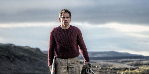
The Secret Life of Walter Mitty
Unlike many projects that incorporate a tonne of VFX to the point where analyzing the photography is not only difficult but probably useless, Mitty is an effects-heavy film that required pitch-perfect visual shooting of actors to incorporate into the very odd story.
It’s clearly Stiller’s vision, one that has blood, sweat and tears all over it and regardless if you like the film or not it’s one very dazzling and emotional ride. Remember, this is a film about a man who leads THE most mundane life you’ve ever seen (cue the hard boiled egg and the toast) and the fantasy worlds he slips into. But think about how easy it would be to pull a “Roger Rabbit” and make those two worlds so disparate from one another, and now think again about the trailer for the film: you don’t really see the transitions coming. They just happen.
Beyond the fact that everything looks stunning in the film, and it does, Stuart Dryburgh did a super-human job of making the entire visual feel of the film be integrated and connected and still have subtle changes in keeping with Mitty’s imagination and ever-changing landscapes. There are also some crazy camera moves in this picture that could not have been easy to pull off, and again they integrate and marry well with several other still-frame aesthetics elsewhere in the picture. In a long career that’s included many great beautiful films, I think Mitty is one of Dryburgh’s best outings and overall, a special film for photography.
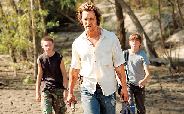
Mud
Adam Stone is a badass. This guy has something to him that basically feels like a 70’s photographer who just lays it all out there and makes things instinctively, not without technical knowledge but also not pushing any agenda or *forcing* technique, and just tells great stories with images. This film could not have been easy to make.
While everyone is going to fawn over the other McConaughey picture of the year, amazing as it is, this picture was really well done and the photography is a true champion. Look at how much of this is exterior, dawn, dusk, day, or night. Like 80% of it? The matching and consistency is amazing and more importantly it seems that Stone using the “God as Gaffer” really thought about framing first and lighting second (oh, and I should also mention that his lighting-second is better than most people’s lighting-first’s, if you know what I mean). The gunfight towards the end of the film takes place practically all at dusk and gets gradually darker. The photography work there is reminiscent of the sun-rising on No Country For Old Men and you can’t get much better than that. Stone’s work in this picture allowed for the rural south to be both small-town USA and a little bit of Robinson Carusoe, a little bit of magic tossed around for good measure.
The film is expertly told and the synergy between Stone and director Jeff Nichols is as though we’re watching Cronenberg and Suschitzky — like they’ve been doing it for years.
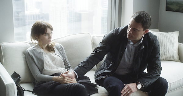
Side Effects
Yes, it’s impossible to draw the line where Soderbergh ends and his alter ego Peter Andrews begins, both in terms of the craft of using the camera and in terms of the sensibility of lighting, but let’s note a few key things about this film.
Following up on some of the excellent work in Contagion, wherein there were probably 150 locations and the film never got confusing, Side Effects shows a completely different aesthetic in terms of composition and action and this movie kicks ass. It got short-changed all to hell by everyone, and frankly I can’t understand why. It’s as close to a Hitchcockian thriller as you’re going to get and the execution probably exceeded the writing (which was also great). Much in the same way Michael Mann’s Collateral wouldn’t have been the same in anyone else’s hands; such is the case with “Side Effects” and Soderbergh. Soderbergh isn’t underestimated as a photographer but he’s also not given the credit that’s due–he’s top notch. Some of the carefully planned moves inside the office therapy sessions added to the subtlety of the story telling and the overall use of space and character’s relation to space and elevated the storytelling. Sure there were signs of Andrews’ now-familiar heavy-on-the-yellow or heavy-on-the-green but it’s not the same as we’ve seen in the past.
Two sequences to look at in detail: The stabbing sequence of Tatum and the car crash into the wall. Both required deft use of camera and action and both just flew by without distracting at all. This film is an exercise in cinematic subtlety and understatement, take a second look.
The Place Beyond The Pines
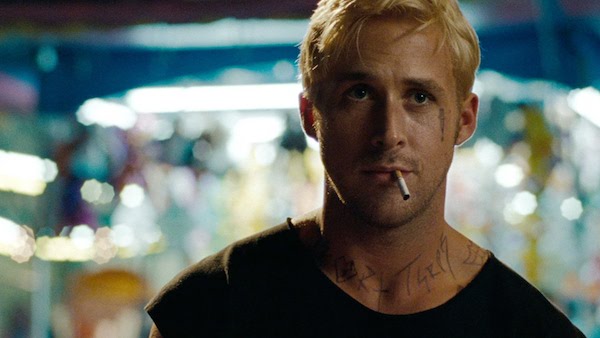
Why Derek Cianfrance didn’t use Parekh a second time after the incredible collaboration on Blue Valentine, we don’t know–and to be clear, a lot of the time this comes down to scheduling pure and simple–but Sean Bobbitt is like a force of nature. The guy’s got more energy than you can imagine and about as much diversity, too. While some photographers who always have a different “look” for every picture seem to be trying too hard, Bobbitt just feels right every time. And I mean like every time. Did you see Hunger? DID YOU? That deserved like 15 Oscars for categories nobody has thought up yet. But his photography was stunning; in a 90-minute film with probably 20 minutes of dialogue all over one scene.
But back to this picture, it’s a stunner. Long takes, incredible camera technique, and an overall colour palette that feels like something out of Renoir or Van Gogh more than Kodak 500T. Bobbitt’s lighting is only outdone by his lensing, this picture is a veritable feast for the eyes.
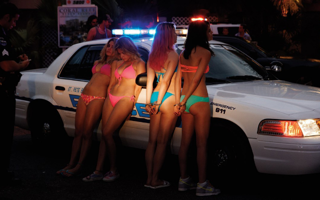
Spring Breakers
I haven’t met this Benoît Debie character yet but when I do I want to get one of the Babel Fish-things that’s mentioned in “Hitchhiker’s Guide” so I can understand what kind of alien-planet-genius language this guy is speaking. I’m that confident that he operates on a different plane. This guy seems to break all the rules of photography and do it seamlessly and without fear. His use of color, exposure, and mood are incredible. Damn right Gosling chose this guy to shoot his first picture, who wouldn’t??
While there’s always a general preference towards “Natural” in cinematographers’ handbooks and discussions and approaches, this guy’s stuff looks about as natural Clint Eastwood talking to an Obama barstool. Did you see Enter the Void? Yeah like that has any relationship to what you see with open eyes. Here’s a guy who uses the film like a can of spraypaint in a back alley before the cops show up. Everything just gels together and in the case of Spring Breakers, it doesn’t belie the story one bit. If the film is about the all-encompassing vapid-ness and saturation of the MTV-porn-obsessed younger generation, there was no better way to express it than with this cacophonic, brash, ultra aggressive, neon-loaded, candy-crush of pictures. Half naked women have never looked both more objectified and more individualized at the same time. A tour-de-force of heavy imagery and splattered storytelling, Spring Breakers is awesome.
And for what it’s worth, 4 of the 5 of these were shot on 35mm.
